In Conversation with Ng Eng Teng
Constance Sheares
This document is part of a joint project of the NUS Museums and the University Scholars Programme, National University of Singapore. This image and accompanying text appears here with the kind permission of the NUS Museums. Note: click on any of the pictures in the following text to obtain additional information and larger images, which take longer to download.
Why are you making this donation?
This donation is to complete, increase and strengthen the present collection.
It is quite substantial in terms of numbers. In future, it may be less - a few pieces each year. The cut-off date of the collection in the Gallery is 1990. This donation consists of works from 1991 to 1998. They were reserved for my tenth solo show and, as the present collection stops at 1990, I am very happy to donate the whole exhibition to the Gallery (NET Gallery) to make the collection more complete.
This exhibition will consist of fifty sculptures and about fifty life drawings which I re-started in 1991. The nude drawings are quite specific but, to me, they are pretty mild; I wouldn't say they are erotic.
Apart from presenting the donated items, I would like this show to be on record as my tenth solo exhibition.
I note that, among the sculptures, there are ceramic pieces, as well as a few in bronze and stainless steel, even one in brass, but not a single one is of ciment fondu. Are you no longer working in this medium?
It is true most of the works are in stoneware ceramics and none in ciment fondu. I think it is because I have been working on the theme of Torso-to-Face, and these works got more interesting and inspiring, one piece after another.
As a result, I continued to work with clay on these bulbous forms and to enjoy it. So, while I am in this momentum and state of mind, production continues. Eventually, I will go back to ciment fondu. I think it is a nice material to work with, and a very good material for sculptural forms.
 After working with and trying out so many different materials, like bronze, marble and clay, I find ciment fondu a better material for sculpture making. With ciment fondu, I can make a sculpture hollow, so it would not be excessively heavy. Just imagine a sculpture in ciment fondu and cast hollow. The weight will probably be one quarter that of a piece of that size in marble or bronze. Ciment fondu is a very beautiful material. You can stain it to different colours and, should it be damaged, you can repair it back to its original condition; whereas with marble, once it is chipped, it is very difficult to repair to the same texture or grain. The only set-back is in the name because, when you explain that it is industrial concrete, people do not often think highly of an art work made from it.
I am thinking very much of going back to using ciment fondu quite soon. I feel I can express much more in ciment fondu. I am thinking of casting mainly. That means I have to work the original in clay, spend more time in the concept design and composition, working to full satisfaction, before casting. That gives me more time to understand the work.
With ceramics, you have to be quite fast with the process. You cannot take too many days
to work over a piece of ceramic sculpture because, once you have built up the form and it has firmed up, it is difficult to change the form.
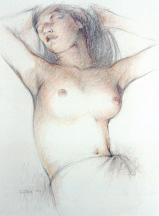
You executed your first life drawing in charcoal and pencil in 1963 at the Farnham School of Art in England. Since you returned to Singapore in 1966, you had to forego this practice for quite a long time. When did you resume it and under what conditions?
I re-started life drawing in 1991. This was because there was a group called Group 90 which was started by Namasivayam, and Chia Wai Hon and Sim Tong Khern who were art teachers, semiretired from schools and the Institute of Education. It was a common interest in life drawing that brought us together to share the cost of paying the models. At the beginning, Nama would leave his telephone numbers in small hotels where the back-packers go, and they would respond. That is how we get the models and it is quite easy. Sometimes there are a few phone calls each week from people offering to pose, but we only need one model a week.
Besides your group, aren't there other life sketching groups now?
Yes, there are quite a few groups. There is one in the Federation of Art Societies which has a few evening sessions per week. The Outram Park Community Centre has a life drawing group, and I know Teng Nee Cheong has his own private group. Lu Guo Xiang, I heard, has also formed one. Some artists work privately so they get models for themselves.
This interest in life drawing came about probably ten years ago, when the mainland Chinese artists started exhibiting nude paintings in Singapore. They started a bit of an uproar and created a lot of interest in and awareness of nude drawings and paintings. Subsequently, the local artists started life drawing and exhibiting their works. Nowadays nobody raises an eye-brow about life drawing groups, or even exhibitions of nude paintings. I think currently there is a nude drawing exhibition on show by the Federation of Art Societies. And Group 90, the group I draw with, will stage a nude drawing and painting exhibition from 17 to 21 July, 1998, at the Orchard Point gallery. The Society of Chinese Artists' recent exhibition also included a section on life drawings. So it is getting pretty common and not unusual. But of course, the sale of nude drawings is just not doing well; we don't seem to sell that many. I suppose a lot of people are shy about hanging a nude painting or drawing in the house.
What do you personally gain from this practice in life drawing?
It's more or less a form of practice, like people doing calligraphy having to write every day to improve or maintain the agility of their hand movement or their thinking. In my view, it is not so much to learn but to express and to interpret and, hopefully, to be inspired by it. In my life drawing, I try to make the figures as sensitive and sensual as possible and that, to me, is the purpose of having a model. There is no point for an artist to have a model and then paint a figure in pure abstract form or just splashes of colour. I feel that is just wasting time and money. You don't need a model if you are doing it that way; you can create that kind of image in your mind. When I have a model in front of me, I have to be 'truthful' to the subject. So what I try to do is to put life and bring out the spirit of the sitter, apart from concentrating on technique.
Is that why you use coloured pencils for these drawings?
 I came to use coloured pencils by chance in 1991. I was in Straits Commercial Art Shop one day when I noticed a beautifully packed set of 18 coloured pencils by Caran D'Ache to commemorate the 700th Anniversary of the Swiss Confederation. I bought a box because it was attractive. When Nee Cheong told me there was a model to pose, I just grabbed the box of coloured pencils and off I went and found I could make sense out of them. As a result, I became stuck to the pencils.
With coloured pencils, at least, you can try to depict the reality of the subject. But it is still impossible even with coloured pencils to depict life and flesh. No matter how much you try, it will be difficult.
I have benefited from these years of life drawing in that it has given me a new theme - the Torso-to-Face series - which came about from doing these drawings. Of course I wasn't consciously expecting this to happen when I first got back to life drawing. But at each session I see an image of a face looking at me from the body, and this impressin gets more intense each time. But how do I solve it, how do I utilise this idea? It did not take concrete form until about 1994, when the Torso-to-Face series began to appear, one piece after another. So, from 1994 up to now, I've done quite a few pieces, and I am still enjoying it, as more designs appear. I could be at the tail end of it now because I have explored this subject for quite a few years.
Were the Torso-to-Face series exhibited for the very first time in 1994 at the Goethe Institut Gallery, in a group exhibition?
I can't remember exactly whether 'Claytivity' group had the show in 1994, but four works on the Torso-to-Face theme were first exhibited in the 'Contrast' show with Iskandar Jalil at Takashimaya Gallery in August 1994. That was a joint show and it was exhibited there. That was a 'Claytivity' group exhibition at Goethe Gallery in June 1996.
I remember, in the Takashimaya show, I had about four pieces on display and they were all booked before the opening day. It surprised me that this series was so popular because I never thought it was going to take off so well. Exactly why, I don't know. I wonder whether, because of their popularity, I am doing so many of these works. I think not, because I am still finding the series fun, a lot of whimsical elements, much hidden sexuality or whatever. Many people are interested in it because it is probably a tongue-in-cheek sort of expression. But some others do tell me these are pretty direct and obscene.
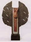
It seems to me that the harbinger of this series is Red Face which is in the Gallery, a humorous, witty reconstruction of the human face.
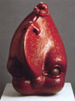 Maybe you have a point there because in Red Face I have utilised just a face. Quite a few works are based on a head and a face. So I am sure it has a connection. To me, a head and a face can express the whole emotional thinking of a person. The components in a face are important the eyes, the mouth, but not so much the ears; I seem to eliminate the ears but the nose plays a part. The main expressive elements in the face are the eyes and the mouth. The nose could help in the composition but, somehow, I am not too concerned about the ears.
Yes, I think in some cases you have even transformed the ears into horns.
That's right, like in Bull's Head.
Was that consciously done?
I think it was because the appearance of the face looks bullish. So adding two horns does help to explain the form.
It would appear that the themes that were begun much earlier, even at the start of your career as a sculptor, have been continued in the later works, like these pieces here, the bronze seated female figures, cast in Thailand, although they are very drastically abbreviated. I think the torsos, the Modesty series and Sitting Pretty are all themes of the eighties or even earlier.
When you refer to the Modesty series, there is a piece in the gallery dated to 1986. Although there is a certain amount of abbreviation already, you can still see half of the head and three hands. But the two Modesty sculptures in this coming show are abbreviated much further. The forms are very simple. Conceptually, this series is different from the earlier one. This second series is inspired by the way nude figures reproduced in magazines or newspapers are taped over to mask the vital areas. Since I didn't want to mask off the vital areas, I might as well carve them out. So I literally carved and hollowed them out. Both are stoneswares, one of which I made in China, using pomegranate red glaze, which is also known as ox-blood red.
The pieces with the flanges, like The Fan and Blue Ribbon were developed from the more simple Clouds over Mountain series, but you have given more serious meaning to the later works.
 The flanged pieces are follow-up works from the earlier series, Clouds over Mountain, perforated with circular holes, whereas this flanged series have geometric cut-outs. We often use fans, either folded ones, or the open fans, to cool ourselves; we also use them to make a fire. So, on one side of The Fan there are two drops of water to symbolise coolness, and on the other a little flame. So, the fan can be both a positive and a negative instrument, and that is why I thought it is quite a meaningful form.
What about Blue Ribbon which has a similar form? Has it a meaning?
Blue Ribbon has no specific message. In the course of creating it, I just felt like adding a strip of blue glaze, and then I called it Blue Ribbon.
There are also some abstract pieces which you have given enigmatic titles, like Fallen Crown.
 I suppose this piece means nobody stays up forever. One day, one just has to step down. So, symbolically, when you are up there you wear a crown, and when you are no more there, it signals a falling crown! This piece is my favorite because it incorporates quite a few ceramic methods. First, I fired the 'crown' in blue crystal glaze. The crystals didn't turn out well as they were very small. This was fired to stoneware, at 1,200 degrees centigrade. Then the 'crown' was wrapped round by another clay shape, and the whole piece was biscuited, including this metal wire on top, with a little ceramic sphere. After it was biscuited at 1,000 degrees C, I pit-fired the whole piece, burying it in a pit with lots of saw-dust, and copper carbonate and salt, which register flashes of pink, red and black. Biscuit firing at 1000 degrees C is lower than stoneware, so it doesn't alter the glaze of the crown.
This piece was fired three times. First, the 'crown', then the incorporated body is biscuited, and finally it is the pit-fired. The result happens to be very interesting - natural pink, red and black. This work has a combination of quite a few techniques and different materials. It will be impossible to produce another piece like it.
Peace Time appears very different in form and in the treatment of the surfaces. What does it signify?
 Peace Time has a camouflage design painted on it, using oil paint. It is the first time I used oi paint on ceramics in this way, thick and pure. There is a kind of bullet shape on a semi-circular form, and then the whole is contained within some extruded geometric clay grid which resembles A cage. It has a 'camouflage' colouring like that o our army uniforms, but in very bright colours. I call this Peace Time, for in peace time, all war weapons are 'caged', held in check, put there to be used at any time.
Peace Time was fired slightly lower than stoneware, at I,100 degrees C, and then painted.
It has a similar meaning as Portrait (1986) which is now in this gallery.
Yes, Portrait consists of three bullet forms and the top one has two mouths, one talking oi peace, and the other, behind, shouting for war. These are two aspects to life. I did two pieces on this later series, one of which is now sold. It is in ceramics and painted in a colourful 'camouflage' design. These two works are related, and have something to do with war.
You mentioned that you developed the Torso-to-Face series from 1994 onwards. But I see Red Face in 1986 as germinal to this series which was then taken a further step forward in Bewitched in 1992.
As a face, it goes back quite a few years to Red Face, using the head and face as the centre of interest. It is being developed, abstracted and abbreviated, in particular, with Rat and Big Nose. Big Nose has already been abbreviated to just a nose and two eyes, and Rat is actually a follow up from Big Nose. While working on Big Nose, I thought, why not stand it upright, it might also be interesting. That was how it developed. Rat, in fact, is a face. It was created in the Year of the Rat and, short of a better title, I called it 'Rat'! To me, titles are mainly for identification purposes, so don't read too much into them.
What about Bewitched? I consider this a landmark piece in the development of the Torsoto-Face series.
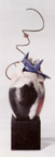
 Bewitched is in bronze. It was inspired by my life drawings. It is rather abstracted and very much abbreviated with a thin body and long arms and the breasts looking like eyes. Bewitched was one of two pieces. Sadly, one piece exploded during the pouring in of the bronze. The mould was made in Thailand when I was working there. The mould maker was not careful to reinforce the outer investment. Being a big work he needed to use metal rods to encase the whole investment, but he didn't. He was in a hurry and took dangerous risks. When the bronze was poured, the mould just cracked away. My heart sank. After working so hard and so many days modelling these two works, which were exciting, this had happened. I was quite upset and very disappointed.
Sitting Pretty and Small Eyes appear to be variations of the same theme.
They are variations of the figure. Yes, I see Small Eyes and Sitting Pretty as probably closer to Bewitched in some ways. The Bewitched that exploded had a big cavity in the centre of the figure.
It is interesting to compare them with the drawings from which they were conceived. Clearly, the two are related.
Yes. In a way, sketching from life or drawing nude figures sounds very traditional and basic; yet I think I have benefited from it, first the Torso-to-Face series, then the abstracted figures. It gives a new concept of the body. My doing life drawing hasn't been futile.
So works like Small Eyes and Bewitched were developed from the more realistic drawings through these abstract drawings, Abstract Torso I, II and III, 1992?
Yes, that's right. One never knows. I may transform these abstracted drawings into oil paintings in future, because they are quite stark and with lovely shapes. The problem is that I can't find time for painting. There are so many things to do in three-dimensional form yet!
You have continued to produce the abstract 1 + 1 = 1 series, also in brass. Why was that?
Well, I like to try out different materials. For the first two weeks of working on 1 + 1 = 1, I used aluminum. Following that, I did a piece in ceramic stoneware, and later in stainless steel, and brass. Since these later works were fabricated in a workshop, I requested for an edition of three pieces each.
People find these geometric forms not so appealing. I suppose, time will tell. Usually new works take a few years for people to understand and accept.
I think the Torso-to-Face series, your latest, in fact, is among the most striking creations of the nineties. Can you explain how the idea of these sometimes outrageous sculptures evolved?
The whole idea started with drawing the nude; each time I draw I see a face in the body That was the very start of it. The masking idea came from the paper and magazine reproductions of nude figures, with masking tape over vital areas. Masked in Blue is exactly about that.
What is the meaning of these veiled figures which are perhaps the most provocative of all the exhibits?
A few works on the veiled faces are inspired by the outlawed Al-akram movement in Malaysia. Years back, I saw a few women in the MRT trains, all in black, including veil, gloves and socks, leaving only the two eyes visible. They can look at you, but you only see their eyes. I feel at a disadvantage. This sort of feeling started me off on the veiled figures
In the Liberation series, of which Breakout is one, you use bindings. What is the significance of this figure which appears to be trying to free itself from a covering of bandages?
I think I have to keep it still a secret. It's something very personal which I suppose in years to come, will be revealed, just like my illness of tuberculosis. I am surprised you have noted it. Yes, it has very deep significance for me. This Liberation series is in some way about the difficulty of getting out of being what you are. So, there, I have given you a little mystery!
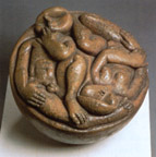
Garden of Eden belongs to the Acrobats series, of which the earliest in this gallery dates to 1971, and which is more totemic and rigid than this fluid and sinuous late work.
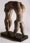 Garden of Eden was inspired by the Bible. Some of my other works have reference to the Bible, such as Prodigal Son, The Cross and John the Baptist. Also Hostage which looks like a figure of Jesus Christ. Garden of Eden is based on the Adam and Eve figures, and as you pointed out, it could also be Acrobats, a combination of two figures, in this case, linked together. The composition is unusual. Normally, I have a bulbous form at the base which stands by itself In this case, it is supported by four legs, so the structure is different. It is like Acrobat, in which the figure turns, arching backwards and balanced on three points - the hair and two legs Garden of Eden has four points, standing on four legs, so it has a more floating form, rather than being bottom heavy. You know, a lot of my works are bottom heavy; they are trying to get out from the earth, but this one is sort of tip-toeing on the earth
In the way the two figures are joined by their heads, or even share a head, this work is reminiscent of Bottoms Up which probably dates to the mid 1980s.
Bottoms Up is not two figures merged together but rather one figure with the body parts rearranged. I was just trying to be funny and playing God! In a way, it is something like Red Face, where I twisted the components of the face around to recreate a face. If we have been born with a mouth up there, I think we would accept it anyway The problem would be when we get a cold all the dripping will run into the eyes below! So in Bottoms Up I had fun and created a pair of legs rising up from the head. It is nonsensical, but then, if we were actually born in that way, we would have found a way of going around with it, just like a person born without arms. Recently, I saw in a TV programme, a man in China who was born without arms and he did everything with his legs and was very agile with them. He adapted himself to living without his arms. So, I suppose, out of necessity, you would find a way. Let's forget about it, I was just being naughty and having fun!
I would like to ask about techniques. In Head Profile (1991) and Spring A (1993), you used the pit-firing technique. Can you describe it briefly?
Pit-firing is to give decorative effects to your ceramic work. Firstly, try and use white clay and burnish it before you biscuit-fire it. The smoother the surface, the better the result; so I use a piece of rounded rock to burnish the form which has got to be simple. If it is too elaborate it is difficult to burnish the intricate details. Then biscuit it at about 1,100 degrees centigrade. You build a pit either by digging into the ground or you build it up with bricks from the ground. Place several layers of saw-dust, different grades to form different layers. After you have put in 40 cm of saw-dust, you place the works on the saw-dust, remembering that the areas that lie on the sawdust will turn black. Then around each work you sprinkle salt and copper carbonate. Copper carbonate, in reduced condition, will give you the pink and red tones when reacting to the sodium vapor from the salt. The result would be soft, uneven colours, but very subdued and sensitive.
We use quite a bit of copper carbonate and salt. And after that, we cover it with more layers of saw-dust. Then finally, on the top, we lay stacks of wood. To fire, we use newspapers and a little kerosene to light it. It will burn down slowly. As it goes down, it warms the ceramic forms so that it wouldn't crack. We let it burn overnight, until the next day. You can see the ceramic works with the ashes around them. Looking at your works you will know whether your firing has been successful, with lots of red or just black and greys. It is not a hundred percent certain that you are going to get beautiful pinks and reds, or in the areas you want them. A lot depends on chance here.
What is 'inlaid' stoneware?
Inlay is a decorative technique. While the clay surface is still moist, you scrape off a design on it and then paint a very thick slip (clay in a creamy consistency and coloured with oxides) over it. And once the slip firms up, you scrape off the excess to expose the scraped pattern. And if you want to have a few colour inlays, you repeat the process of carving, applying slip, then scraping. The process is tedious, and you work on simple forms with no fine details because of the scraping. A simpler and plainer form will give you a nice texture of different coloured clay.
You don't need to glaze inlay as it is quite attractive with sculpture. If you wish to, you may
thinly lacquer the piece or wax it. Inlay work is often found in Korean wares, with carved out images of flying storks, or whatever. They are inlaid with different coloured clay so the flying storks appear in multi-colours.
Is staining done after the firing?
Yes, staining in my work is actually artificial and superficial colouring. Staining proper involves mixing an oxide into your clay to stain the clay. In my case, when I say 'stain with colours', it is usually painted with colours after it is fired. I use materials like oil paint or, as in Spring A, coloured ink. This piece was pit-fired but the colour didn't turn out beautiful. So, I poured some ink on it - blue, green and red ink. But as it was not fired too high and the absorbency was very great, I poured in a lot of ink and it just got absorbed each time. But in the end it acquired a very mellow stain.
What does Spring A mean?
I did a series on Growth forms, which has got to do with Spring -- four pieces in different forms, but this is the only one I kept for myself. I like this one very much, so I kept it. In my work I explore materials, colours and textures. To me anything that enhances a piece of work, I'll just make use of it, without worrying whether it's right or wrong.
You have explained the method of producing pomegranate red or ox blood red glaze. But there are also pieces, like Red Pony Tail (1994), with a 'red glaze'. What is the difference?
Red Pony Tail, is a red glaze and that was fired in Singapore. This red glaze is just red oxide added to the glaze, so it's not like the genuine pomegranate red or ox blood red which is a reduction of copper. This glaze is much easier; you just apply and fire it, and it comes out red. You don't have to adjust your kiln condition, or reduce or smoke it heavily to obtain the colour. Ox blood or pomegranate red involves firing clay with copper in an oxygen starved kiln. This reduces the copper to cuprous oxide with that distinctive crimson.
Why can't you achieve the ox blood red effect in Singapore? Why must you go to China to do it?
I think the process needs a lot of experience. I have tested the recipe for ox blood here and the result was not too successful, and in certain works I could get only flashes of red. Sometimes you get only some red on the inside. It's either our recipe is incomplete or our firing process is not correct; whereas in China they have years of experience. In fact, they have been firing this sort of red since the late Ming Dynasty. So they are so good at it anyway, in terms of recipe, in terms of the condition of the kiln firing, any piece with the glaze that is put in the kiln comes out all red. It seems so simple.
They know exactly what to use and also the firing condition has got to compliment. Because if you don't have the correct firing process, the copper won't turn into red. You may have blemishes, you may have a half-green, half-red tone. A good red has got to be fully red. If you open your kiln too early and if you get a lot of draught which contains oxygen, then you may re-oxidise certain areas, producing a greenish colouration. But to me, as a sculptor, that sort of flaw can make my work more interesting.
Can you explain how you went to China to do this - how long you had to stay, where exactly you went and under what conditions you had to work?
A Chinese ceramist, Liu Ou Sheng came to visit Singapore in 1990. I met him through Tan Kian Por. Liu Ou Sheng has produced a lot of figurines in Shiwan He was originally with a government factory, the Shiwan Porcelain Factory; he came out to set up his own pottery with his brothers some years back. I think he was one of the very early ceramists who could get out from the government factory and start his own pottery. Liu Ou Sheng has done some very interesting figurines. His works were popularly collected in Singapore, and Kian Por has collected many.
During our meeting, I asked whether there was any chance of my going to work in China in his factory. He said, "Why not? Yes, come". So the following year I went and worked there. I stayed in a nearby hotel and travelled to the factory every day. He would come in the morning and pick me, either in his motor scooter or a truck, and send me back likewise in the evening. In the factory, I would be working with his other workers, using their clay and eventually using their glaze. I coiled my works to about 1 cm thick only, unlike their work which is usually very chunky - about one inch or 3 cm thick. So I could lift up my work easily, but so could they lift up their much heavier work easily because they were strong people who were used to very chunky and thick clay. They couldn't believe that my work would survive because they thought the thicker the clay the stronger the work.
When and for how long were you there?
I was in Shiwan, Canton Province, China, twice, and each time for two weeks. The first time was in 1991, and the following year I was there again for another two weeks. And each time I produced between five and seven works. All in all, I think I have more than ten works.
It was fun working there, although the conditions were not terribly comfortable sometimes. I ate with the management who would have the same food as the workers because they had a mass kitchen. During lunch time they would all bring out their enamel basins to collect rice and vegetables from the kitchen. I was told, before, the management used to have a little better food, but the workmen complained so they stopped that practice and had the same food.
Have you to pay to use these facilities?
No, but eventually the cost goes to paying for my work, such as for the clay, the glaze and the food. So I am, in a way, buying back my work.
How about shipping the work?
Shipping was a big problem. They, being a very young factory, didn't have the necessary facilities to send work out of the country; and also, being very new in this venture, they didn't know how to go about it. The red-tape there was complicating. I was told that it was so complicating that they couldn't be bothered with my few works. So I had to get somebody from Singapore to fly over to Canton, stay a night in a hotel, rent a lorry, drive to Shiwan, then collect the works from the factory and drive them all the way to Hong Kong to be put in a container and shipped to Port Klang in Malaysia. My friend then transported these works to me in his car, two at a time. It was such a problem to get these works from Canton! So, to me, they are very precious because of the process and also the difficulty I had to get them back, involving money, time, anxiety and also obligations to friends. I kept on worrying whether they would ever arrive in Singapore at all. Because of this trouble, I don't want to go there anymore.
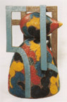
There is a piece called House on Rock A in which you used a stoneware glaze and glass combined. Can you explain how this was done?
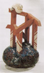 This is one of two pieces I did in 1994. It was is inspired by the tragic collapse of a condominium in Kuala Lumpur, the Highland Towers, on 11 December 1993 that claimed 48 lives. It reminded me of a verse in the Bible about building your house on a rock. Once you build your house on a rock, there are no chances of it falling. Here I have incorporated different techniques. The base was coiled and the surrounding 'cage' structures made from extruded forms and then assembled. Over the top there is a cloud. The rock is glazed and there are little cavities in which I threw blue glass chips. The glass melts like little pools of water. This work combines different forms - organic and geometric.
Throughout the whole work I used terracotta stoneware. The cloud is glazed off-white. Being of the same clay, the contraction and the expansion were similar throughout, so that no structural cracks developed.
Is it all right to ask you about the consequences a major operation has had on your future development?
My recent triple by-pass operation? It certainly weakens me a little bit. I am advised by doctors not to carry too heavy a weight. I suppose that is a setback when carrying is part of sculpture making. It is now the sixth month after the operation and I don't feel short of breath now, unlike before. I feel much better and my strength is more or less back; and in fact I am beginning to carry heavier things and during the last weekend I have been repainting the house. I am happy that I am back to more or less normal. Very soon, as I said, I would like to go back to ciment fondu sculptures and of course I will continue to work on ceramic forms in between. Now, when it comes to bigger works, I am a little reluctant because they take a lot of energy. I would rather work on sculpture of a comfortable size where I don't need assistance or can do most of the work myself.
How do you see your future work developing? What kind of themes do you think you will work on?
That's difficult to say. I am at the tail-end of the Torso-to-Face series. Recently I completed one work which is not fired yet. It is called Body-Talk, and is more or less part of the Torso series. I don't see this theme going on much longer. I may just work on a few pieces and wait for new inspiration.
 I don't force myself to get into a series. It must come to me comfortably. Some time back, I had been working on a series of maquettes on Over Mother's Head, Over Father's Head, Over Grandma's Head, and so on. I may work on that 'baby over somebody's head' - some day. But again, to me, it's an old theme - of the Mother and Child or Father and Child. Except for these, I may just concentrate on a child and a head. I don't know how they are going to turn out. It sounds quite good and interesting.
Yet another series of maquettes is on the Root Form, or the Water Form. That series is very abstract, with suggestions of organic forms, but I don't have much rapport with them. A few of these forms may be interesting and could be monumental if you enlarge them to five meters tall. Along with the maquettes, I have done a few exploratory drawings to see how far I can go with them.
You don't think you will go back to functional ceramics?
No. I don't think I would, not according to the conventional definition of functionalism.
A series of teapots maybe?
Teapots, maybe, if they are very untraditional forms, sculptural and way out!
That's what you've been doing with your teapots all the while, using unconventional forms.
In that case, yes, I may get into it. Presently, there is a teapot in my studio which was supposed to be exhibited at 'Teawares by 14 Potters'. It is made up of a female figure with her left hand on her waist, serving as a handle, and her right hand functioning as a spout. That piece I will donate to the NET Gallery, as a record, as well as other works and ceramics which I have accumulated for the gallery to enlarge the collection.
Now that I have stopped teaching pottery, I don't use the wheel so much. But when NUS Centre for the Arts starts a ceramic workshop, I will be involved one evening a week. So there may be opportunities for me to share my pottery experience with interested people.
--[Recorded on 12 May 1998]
Supported by Oral History Centre, National Archives, Singapore
References
Constance Sheares. Bodies Transformed: Ng Eng Teng in the Nineties. Singapore: NUS Museums/ National University of Singapore, 1999.


Last updated: 11 January 2001